

Mile Play
How can we update the Mile Play offer type to reflect new branding standards while also creating a more intuitive and accessible experience? As a supporting principal designer, I played a key role in collaborating with fellow designers to create intuitive progress bars tailored for the different game types within Mile Play. My team handled the design and continuous updates of the microsite, ensuring that the UI/UX remained consistent between both the app and the microsite. Following usability testing, we partnered with the marketing and content teams to develop a comprehensive content mapping system and reviewed the incorporation of accessibility annotations to promote inclusivity throughout the design process.
Role
Principal UX Designer
Duration
6 months
Date
Q2, Q3 2024
Project Type
Mobile App + Dotcom microsite
Teams Involved
Design, Marketing, Development, Content, Editorial, Brand
Tools
Figma, Zeplin, Azure
Background
The Mile Play program had not been updated for years and was behind on an entire rebrand. The games were lacking in interaction capabilities for users and limited on engaging visuals.
Problem
With engagement low the program needed to be updated in design and improved to draw the attention of users to get them to engage with product more.
Why it's important
Mile Play needs to look consistent with the rebrand to coexist on the app home page while also standing out by utilizing color blocking and animation.


Usability goals
Ensure that users can easily understand and track their progress within the Mile Play challenges, clearly comprehend what actions were required to complete activities, and navigate the interface effortlessly to find necessary information.
Business goals
Increase user engagement with the game by updating the experience with new branding, thereby driving more user participation, generating additional revenue through increased flight bookings, and encouraging users to redeem their reward codes more effectively.
Design goals
Updating the microsite, ensuring consistency in UI/UX across both the app and the microsite with the new United brand standards.
Project Timeline
App Rebrand
The initial focus was bringing the app into alignment with new United Airlines branding while improving the usability.
Usability Testing
We conducted usability testing to understand user motivations for participating in Mile Play and to assess how users interpret the UI on the app and microsite.
Microsite Rebrand
After updating the app, the project moved to creating a microsite for Mile Play, where we focused on providing clear context for new users, managing modal frequency for a smoother experience, and maintaining design consistency with United’s design system and the app.
Annotations + Solution Rollout
In the final phase, I collaborated with the marketing team to develop content management spreadsheets to ensure seamless integration with the development team and also created detailed annotations to maintain accessibility standards during coding.
App Rebrand
In the initial phase, the focus was on rebranding the Mile Play app in alignment with United’s updated branding. One UX Designer and one Senior Designer were responsible for the branding of the game types.
Challenge Stylization
Stay the Course
Complete the same activity multiple times to earn the big reward.

Level Up
Complete activities to win rewards along the way, with a bonus for completing all activities.

Do It All
Complete all activities to win reward and redeem the miles.

These color schemes of each of the challenge types would decide the palettes for the other screens throughout the experience of that challenge. The next building block that we collaborated on was building out the different progress trackers.

Due to the repetitive nature of Stay the Course challenges, we opted for a numerical approach, allowing users to easily track how many times they need to complete the activity.

In the Level Up challenge, users earn miles for each game they complete. To help them visually track their progress, we created a segmented progress line with numerical annotations showing how many miles they've earned so far.

In the Do It All challenge, users have unique activities but only earn a reward at the end. To represent the activities that are in progress or yet to be completed, we used icons from the library.


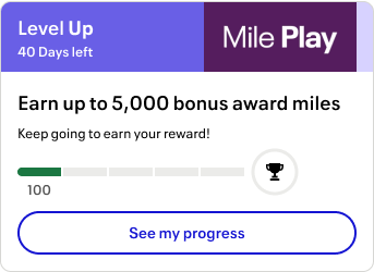

The final challenge tile will be displayed prominently on ‘Home’ and ‘My Offers’ - leveraging target animations and the color schemes to draw user’s eye to the offer and bring in more participants.
Offer Details Page
After registering for the challenge, users can complete activities through the offer detail page. Here, they can click actions that directly guide them to the correct path for each activity. While the offer detail pages share the same template, they vary slightly depending on the challenge type.
Stay the Course

Features a single activity card, designed to make it clear to users that they only need to complete one type of activity.
Level Up

Divides activities into different block links, allowing users to see how much they can earn for each type.
Do It All

Similar to Level Up, but without numerical annotations, as users don’t earn rewards along the way. Instead, we provided a checklist to help users track their progress to ensure they complete the challenge.
Usability Testing
After finalizing the mobile designs, I collaborated with the research team to create a testing guide for moderated user sessions. We conducted testing with 9 users, 3 per game type, using Figma prototypes on their smartphones. After the sessions, we grouped the feedback into themes, identifying 4 key insights.
Intuitiveness
Users found the progress bars easy to understand, and the actions needed to complete the challenges were clear.
7 out of 9 users
knew where to go next after initiating registration
Challenge Perception
The games were perceived more as fitness challenges, similar to Fitbit, rather than traditional games.
“Is it a casino-style game? … Oh, it's less of a game and reminds me more of a fitness challenge in my FitBit app.”
FAQ Issues
Users found the FAQ section overly legalistic and challenging to navigate, particularly when trying to find specific answers.
“I feel like it's very difficult to follow this page. I don't know how many people will be really patient enough to read all the details.”
Trip Definition Confusion
Users struggled with understanding what constituted a “trip” within the context of the challenges.
“"I might be flying the outbound on United and the return on American. Is that a trip or not? I'm not sure if a trip means round trip, or if it's like a ticket? Does a ticket equal a trip?”
After this feedback, we updated a few key elements in the experience, ensuring user clarity around what is expected from them and where they can go to find more details.
1st Focus: Updating Copy
We focused on two aspects of copy:
-
Updating language to clarify that the offer was more of a longer term challenge than a quick game
-
For games where a trip was an activity type, we added additional clarity up front so that users understood what constitutes a trip.
2nd Focus: Updating the FAQ Styling
The FAQ section was too focused on legal jargon and lacked the information users needed most. Rather than having information all displayed at once, I broke it up into accordions so that users can choose what information to reveal. I also collaborated with to copy to reframe the FAQ into a conversational tone, making it easier for users to find the information they need,
Microsite Rebrand
Following the app updates, the project progressed to creating a microsite for Mile Play. This phase presented several challenges:
-
Modal Management: To avoid overwhelming users, we worked with the development team to reduce the frequency of modals, ensuring a smoother user experience.
-
Design Consistency: Maintaining design consistency between the microsite and the app was crucial. We ensured that the microsite adhered to United’s design system standards while still feeling aligned with the app experience.

User Context
It was essential to provide clear and concise context upfront for users who might land on the microsite without prior knowledge of Mile Play. We introduced informative content to help these users understand the benefits of participating.


When a user completes an activity, they will only see a modal when they navigate into an offer page. This provides clarity on which challenge the achievement is correlated to - a difference from the current flow.
Minimum Modals
To avoid overwhelming users, the designer worked with the development team to reduce the frequency of modals, ensuring a smoother user experience.

Users will receive modal alerts on the home page of the microsite for Mile Play so that they don’t have to travel into a completed tile in order to know if they received their reward.

Design Consistency
Maintaining design consistency between the microsite and the app was crucial. I ensured that the microsite adhered to United’s design system standards while aligning with the app's experience. Key updates included:
-
Adding a backlink for easy navigation back to the homepage
-
Integrating the FAQ section directly on the page, utilizing the larger desktop screen space for better user access
Annotation + Solution Rollout
In the final phase after designs were completed, I focused on content management and accessibility annotations.
Accessibility Annotations: I created detailed annotations to guide developers in maintaining accessibility standards throughout the coding process.

Content Management: I developed content management spreadsheets to ensure seamless integration between the content team and development, preventing potential bugs.

Predicting Metrics
With a more approachable design, we aim to attract new users to Mile Play.
Increase in New Users
We anticipate a rise in flight bookings that contribute to user challenges.
Flight Booking Increase
Enhanced clarity around reward codes should lead to increased usage, encouraging users to participate in more Mile Play challenges.